
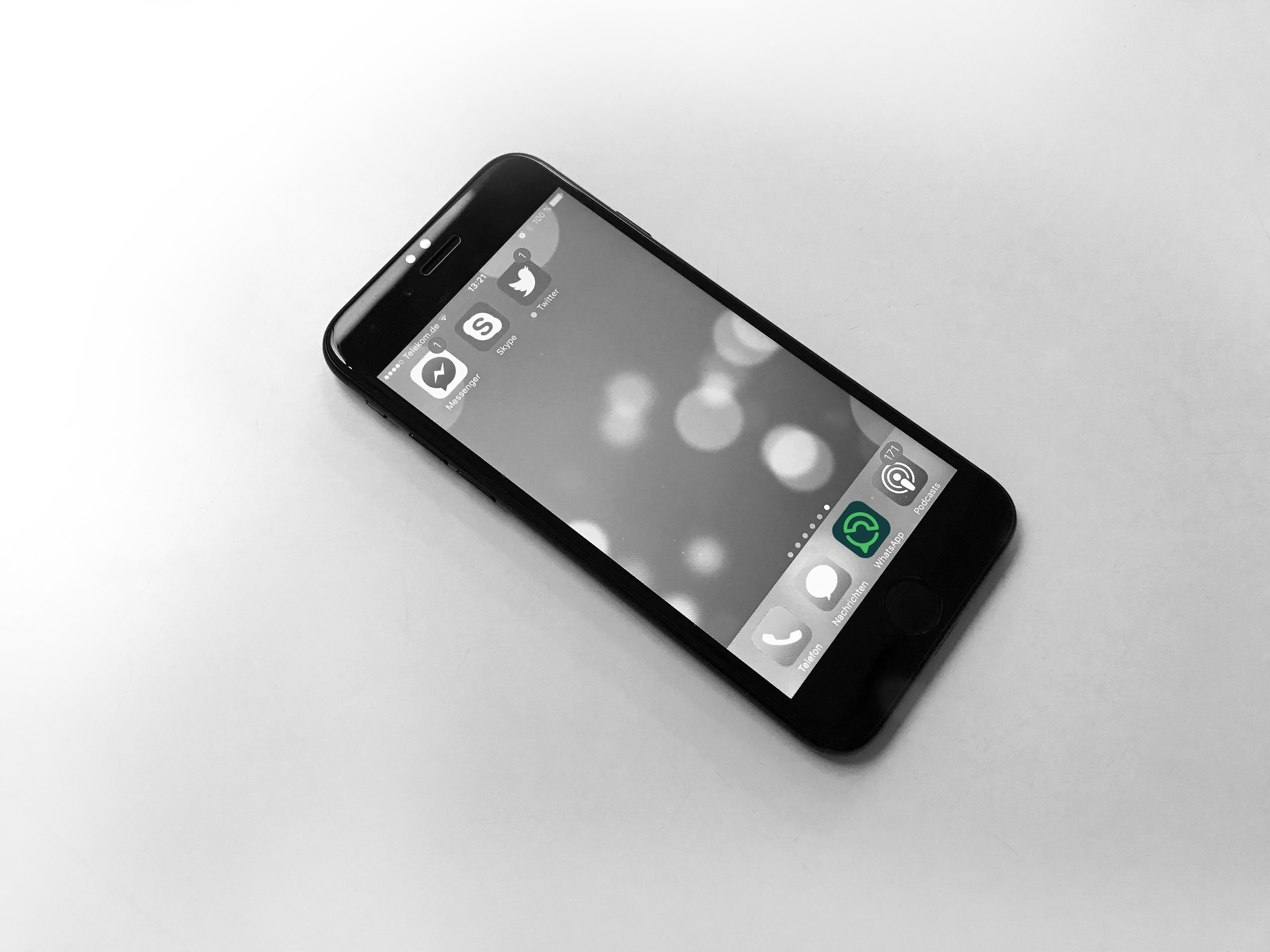
Since WhatsApp is a service that is indispensable for modern days communication world wide, there is no doubt there is a need for a WhatsApp Icon redesign.
The old iconography with the speech bubble and the classic phone served well as a startup.
But that was then, a modern look now is required to match the Apps importance and possibilities.
Other services did reasonable good to evolve their brand appearance to their enormous growth, WhatApp does not want to stay behind.
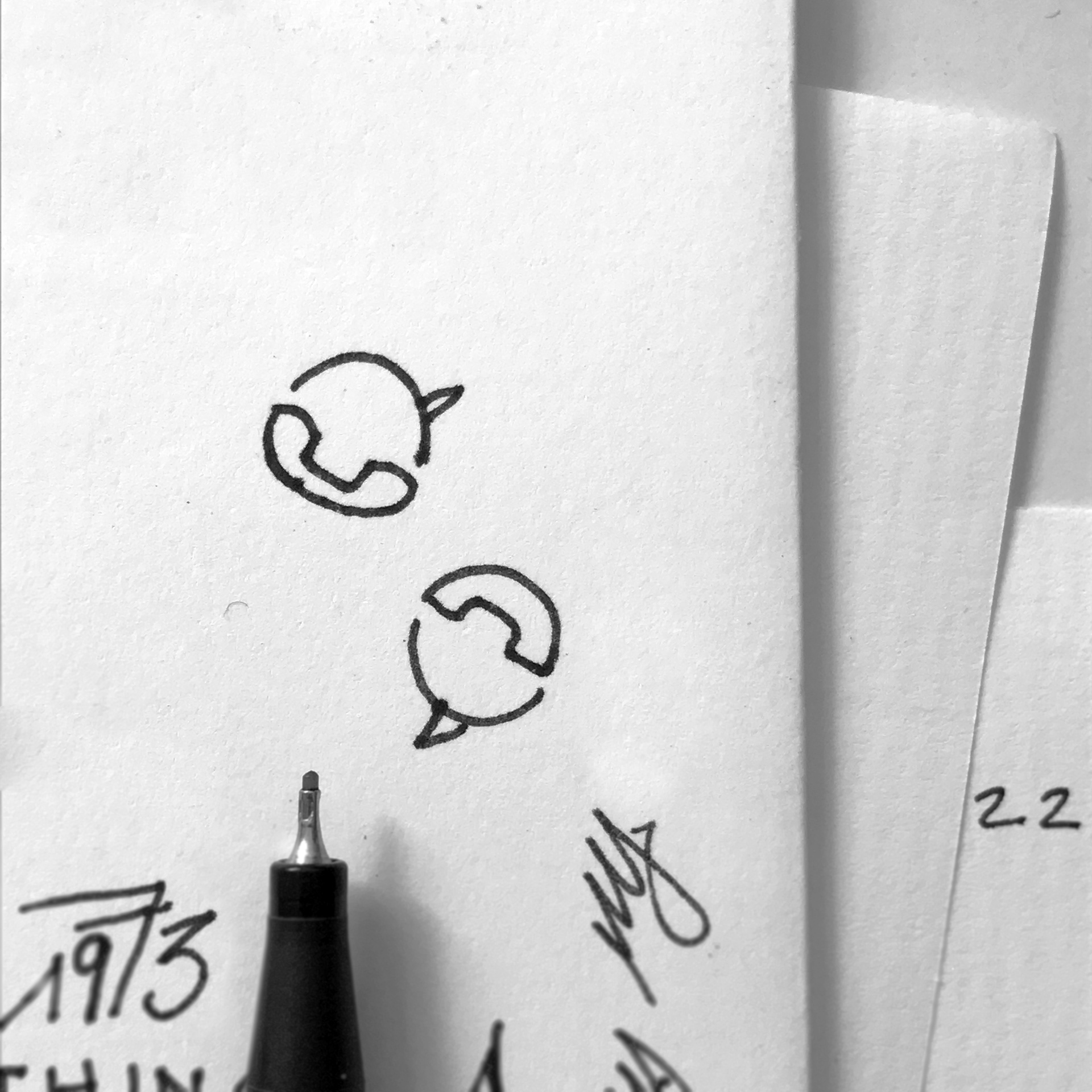
The first analog sketch on a piece of paper that lead to the succession of the design process.
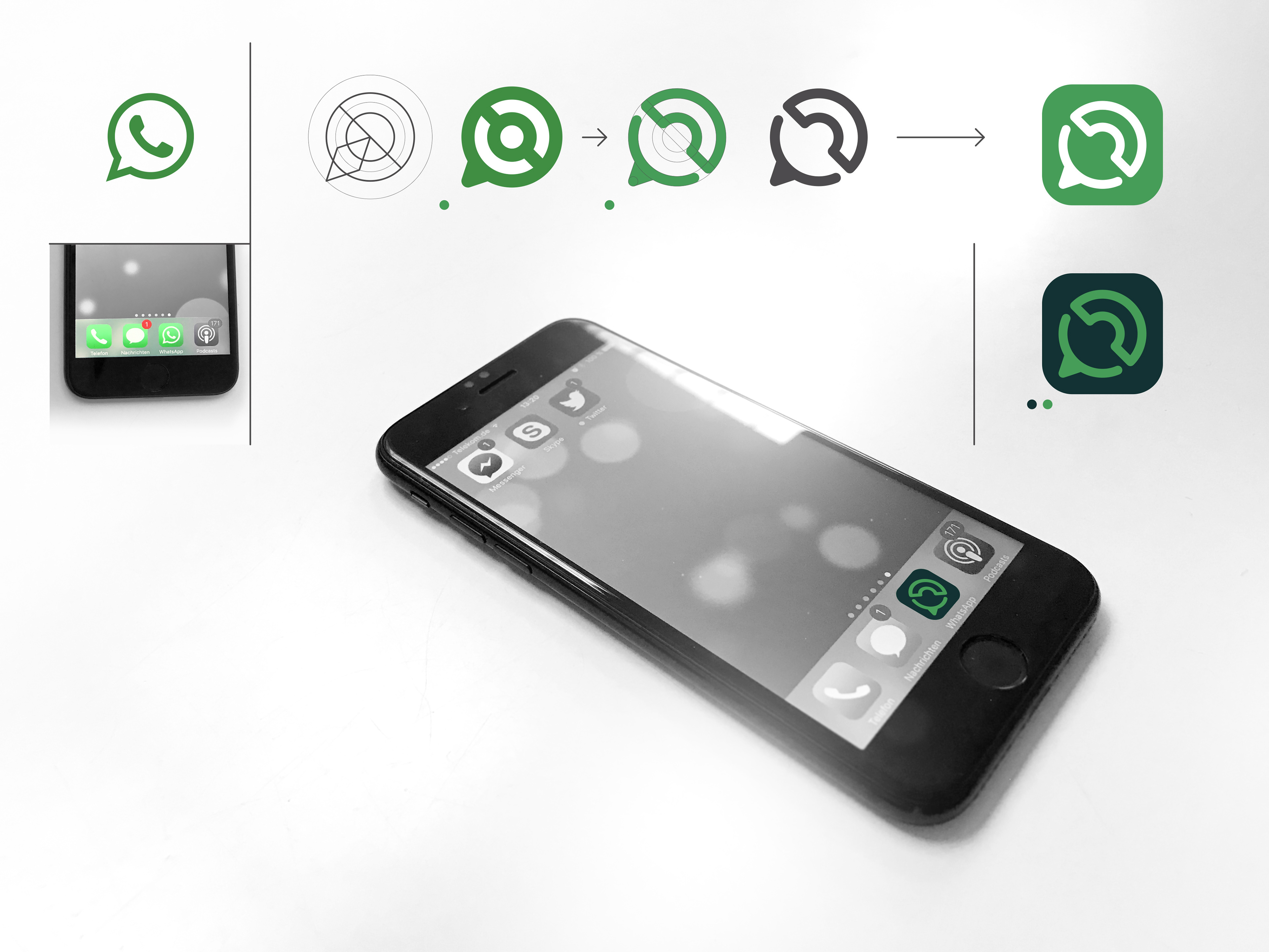
When it comes to obvious geometrical design approach and it’s implementation, the steps to create the new brand logo are simple and consequent.
Blending in is not always the first choice when it comes to being recognised in everyday interface usage.
iOS for example, not to forget Android, appearance. The simplicity suits small sizes.

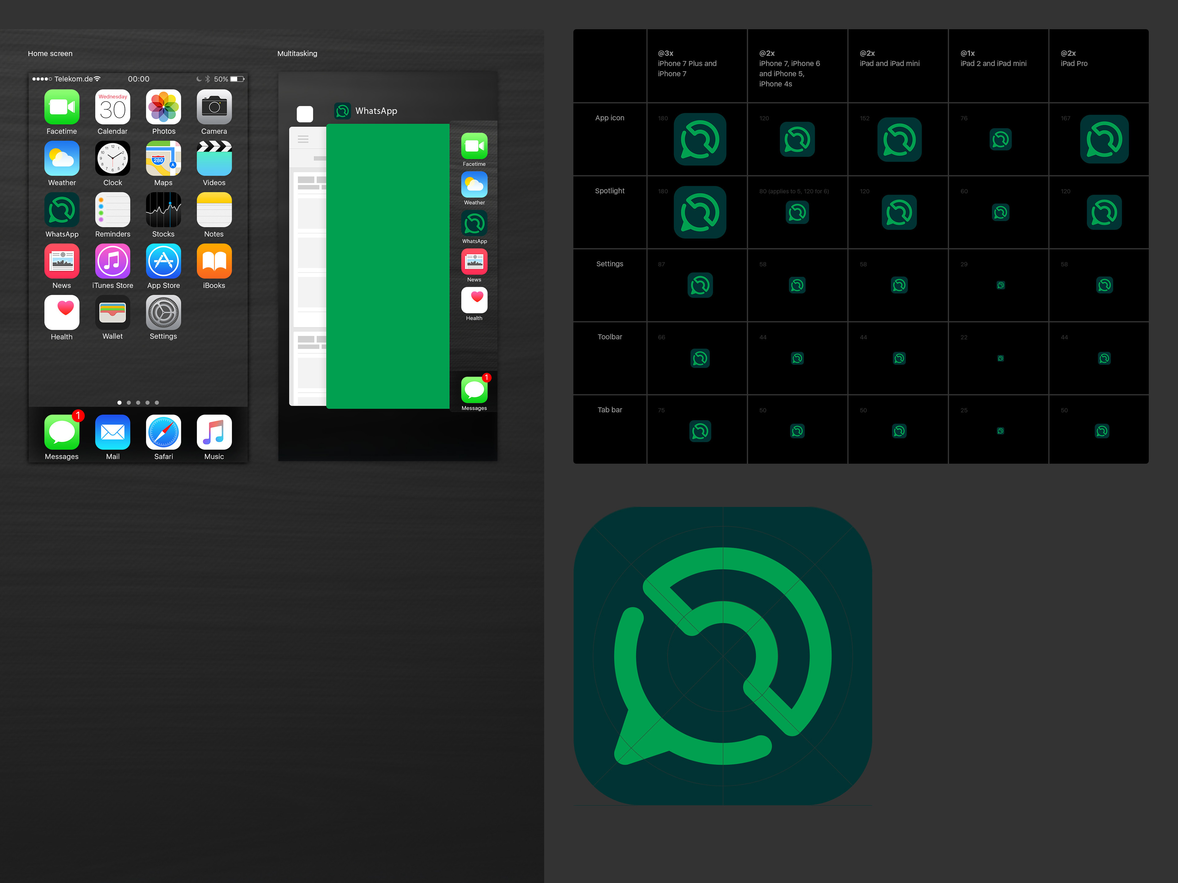
Based on clear geometrical forms the redesign of the WhatsApp icon in this case study now looks modern and fits into a todays environment of user interface and experience.
Thanks for watching, a like or any comments are very much appreciated.